
An exhibition called “From Garamont to Garamond(s): A Typographic Adventure” may inspire deep yawns in most people, but I was excited to discover that there was such a show at Paris’s beautiful Bibliothèque Mazarine. One of my “déformations professionelles,” as the French say, is that I am fascinated by typography: its history, uses and design.
Not only that, but Garamond is also one of my favorite type styles, for its simple beauty and clarity. For inspiration, I am typing this article in it right now (you won’t see it, as Paris Update texts are published in Georgia, the Internet style par excellence because of its onscreen sharpness).
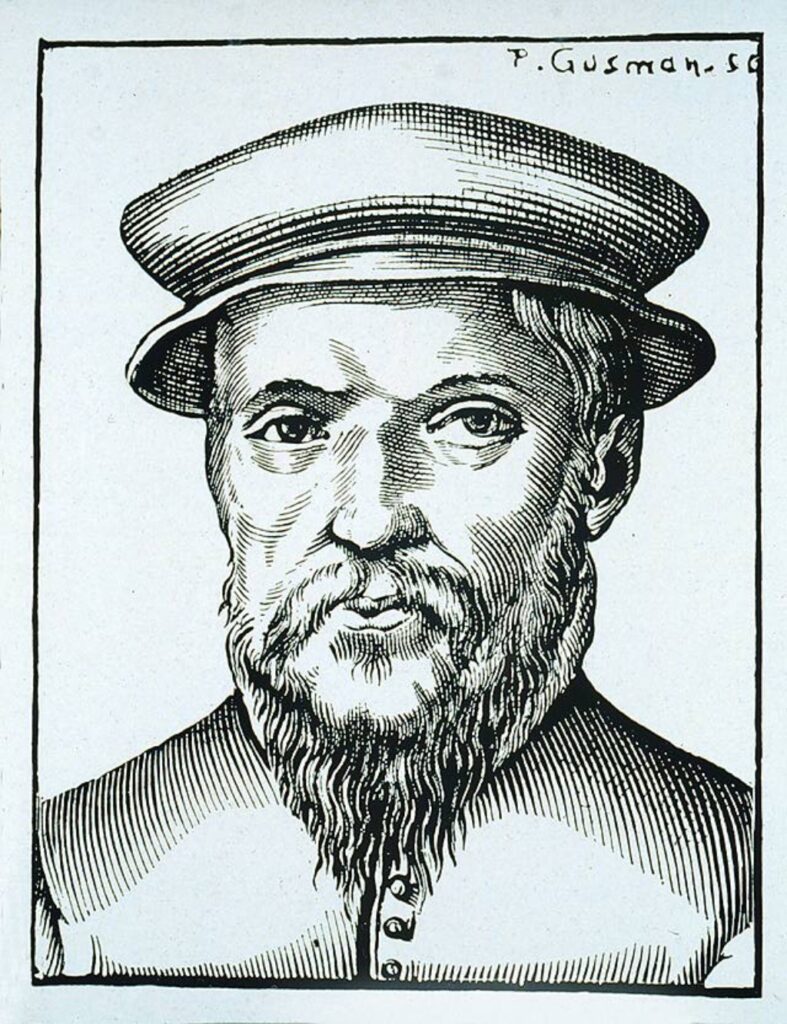
I knew Garamond was old, but I had no idea just how old: it was invented by Claude Garamont (as the name was spelled at the time), a Parisian punch-cutter and type designer who lived from c. 1510 to ’61. It remained popular until the end of the 18th century, when competitive new styles eclipsed it, but was resurrected in the mid-19th century and became widespread internationally in the early 20th century.
It seems fairly amazing that a typestyle invented some 500 years ago is not only still in use but is also very popular in the Internet age, especially when one considers that so many other typefaces have been designed since then. There are apparently hundreds of thousands in existence, and new ones are still being designed today.
Both Garamond and Georgia are serif typefaces, which means that they have those little lines extending from the upper and lower ends of a letter, which, logically, are lacking in a sans-serif typeface. (Serif typefaces are supposedly easier to read than sans-serif, but not everyone agrees, and the debate goes on.)
The Garamond we use today is not exactly the one designed by Garamont. Even in his lifetime, other designers were ripping off his style, and new interpretations of it have continued to appear ever since. Today, there are over 200 digital fonts alone using the name Garamond. It continues to be extremely popular in print, especially in book publishing – it was used for the Harry Potter series, to give just one English-language example.
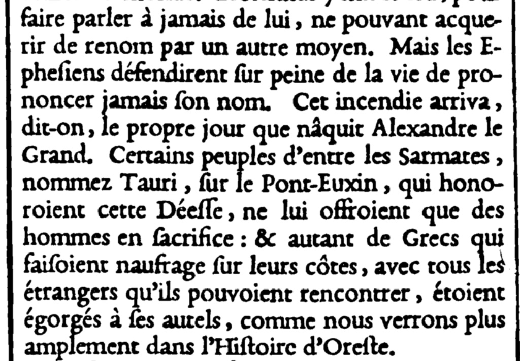
Being a scholarly exhibition presented in a library, “From Garamont to Garamond(s)” may seem rather dry with so many texts on display, but type and book lovers will enjoy learning about the history of Roman characters, the development of Garamond, and the trade of the punch-cutter and printer. They will especially appreciate the many handsome books on show, some of them dating as far back as the 15th century, including one of the “most beautiful illustrated books of the 16th century,” an account of the triumphant entry of Henri II to Paris, published in 1549, open to a page with a fold-out illustration (scroll down to the middle of the page) of a monument featuring an obelisk atop a fantastical statue of a rhinoceros, accompanied by a lion and a boar.
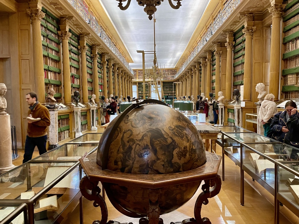
A word about the library: founded in 1643 (making it the oldest public library in France) with the book collection of Cardinal Mazarin (1602-61), it is now housed in the Institut de France, home of the country’s five academies, on the site of the former Hôtel de Nesle, where Garamont actually worked for a time. During the French Revolution, the collection was enriched with volumes confiscated from aristocrats and religious institutions, and it has continued to grow since then, with a focus on historical topics. With its book-lined walls, wood paneling, columns, chandeliers and busts of historical figures, it is a dream of a library. The good news is that anyone can obtain a reader’s card for €15 per year.
See our list of Current & Upcoming Exhibitions to find out what else is happening in the Paris art world.
Favorite
I am mad for Garamond! The only other contender for my heart is Caslon, with a special fondness for Caslon Open Face. And thank you for the phrase, “deformation professionnelle,” wonderful!
What a pleasure to learn about this exhibit. I only wish I was in Paris to see it! The Mazarine library will definitely be on the list of sites for our next trip.